What is Good Design?
For most people new to design, its easy to make the assumption that design is how something looks, how it fits with your companies image or brand; but, thats not a 100% true assumption! Good design has more to do with how well something functions, whereas bad design fails to consider the persons needs.
As amateur designers work in PowerPoint or Keynote, it's easy to get caught up with themes, templates, smart art and diagrams, animations and transitions. Now, these aren't bad things: they're tools! But like anything else, it takes time and practice to learn how to use those tools, use them well, and in the correct context. There is much more to designing a presentation than knowing how to use the tool.
To create a good design that works we need to create and design a presentation that
supports your message. When you sit down to write and design your presentation you should be able to answer these 3 questions:
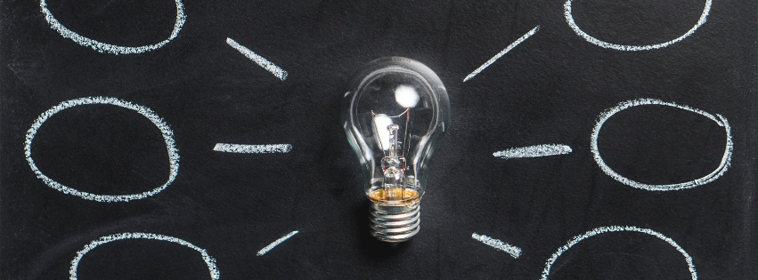
- What is my primary message?
- What is my number 1 goal?
- How do I best visualize this message?
So as we prepare to run through what I expect to be a relatively lengthy yet valuable post here, grab a coffee, some pen and paper and let's learn what exactly good design is.
Taste
Much like cooking, music, cars etc, designing slides can be, well, personal! You like what you like. But, there are times when hosting a party, or attending a certain experience, your personal choice can and should be adjusted as needed. The thing is, not every aspect of design is a matter of personal preference or taste.
The
environment you're in can impact your slides: How is the lighting? Can you read the text on the slide? Is the picture too blurry? It has a huge impact on how the presentation is received by your audience.
Our
biology should also play a roll in your design. While it is not that common by any means, did you know that certain color combinations, bright contrasting patterns that flash colors can trigger headaches and even seizures? It is pretty remarkable how and what is needed to be taken into account when drafting an audience focused talk!
The Three Pillars of Good Design
Audience, environment and message. These should all be embracing your design at any moment! What happens if one of these pillars fail? Well, the design isn't as structurally sound.
1. Hierarchy
The human brain is one of, if not the most fascinating machine on the planet. Through size, shape, color, saturation and texture, our brains tend to manipulate how and what we see and gravitate towards first. So, let's use that to our advantage!
When one element differs greatly from the rest on the page, we have no choice but to give that odd piece our attention. The way you create visual hierarchy is by creating levels of visual dominance or focal points within the design, and throughout your presentation. Most importantly, your slides visual hierarchy should match your content's hierarchy. Basically meaning you should cross reference your outline for your slide design, not using it
as your design.
Now, when hierarchy comes into play of a presentation, a traditional method of general explanations typically involves bullet points. But what else comes to mind when you think of bullet points? Daydreaming! When individuals are hit with the same layout including color and type slide after slide after slide, they eventually stop paying attention to what you are showing them. It is actually through a scientifically proven phenomenon called habituation. Habituation is a
"form of learning in which an organism decreases or ceases to respond to a stimulus after repeated presentations."
So, don't habituate your audience! Choose layouts and visual structures that support your content.
2. Using Space Effectively
Space is an important part of any good design. Like this blog post here, you the audience might only notice the words and not the few photos placed. That is made possible by the space creating separation between objects, and guides viewers eyes to difference sections of the slide design.
3. Using Color Effectively
Color impacts emotion. It draws us in, pushes us away, or sometimes even makes us feel indifferent. When deciding on a color palette for a presentation, it's important to take that into account. While there are many deeper meanings behind each color across the color wheel, let's keep it simple for now!
Color should attract. Think back to a recent party or business meeting. What color was everyone wearing? Did anything standout? Did something not "belong"? Did something standout? Our eyes and our minds will typically gravitate what stands out – and thats a good thing! It becomes easy for us to point out things we like, dislike, desire, or signal we should stay away from...literally! It should highlight important data titles or objects, and not just be there for decoration.
In Conclusion...
Design does not happen all alone. It happens within a community! Speak with your peers, join some online sites like
graphicdesignforum.com,
aiga.com, or
presentationguild.org. There is a vast number of resources out there with many people excited to work with you and assist on your creative journey.
Until next time!
Blessings and blue skies,
Alexander Frank
Special thanks to Jess Stratton, Heather Ackmann, Garrick Chow and Megan Bross for providing a lot of insight and knowledge in this practice!